
Physical branding for medical organisations is an extension of the reputation a practice has already earned through the quality of its service and the professionalism of its doctors and staff. The logo on the wall doesn't create that reputation, but it enforces it in the physical space where patients experience it.
The room plays a real part in how patients perceive your practice. Is it clean? Does it have a calming atmosphere and a relaxing waiting area? Is it nicely decorated, does the whole place carry a reassuring presence? We believe design elements matter to a Praxis as much as the cleanliness or the friendliness of the staff. And a logo is one of the most striking design elements your patients will see. Plants and beautiful furniture help, but what ultimately sets your practice apart from all the others, in design terms at least, is your brand identity.
In this article we take a closer look at nine of our clients and show what works, and why, when it comes to 3D logos for practices and other medical organizations.
The strategic role of a 3D logo for medical practices
Doctors and therapists work under advertising rules that most businesses never have to think about. Advertising must be objective, factual, and truth-focused to help patients make rational health decisions, rather than focusing on maximising sales, triggering emotion and persuading the customer to buy.
That takes away a big part of what less-regulated businesses can use as marketing levers. What remains is showing patients and passersby clearly who you are and where you are. A logo on the wall or facade doesn't promise, compare, or persuade. It gives a clear identity. This makes it one of the few brand investments a practice can make without compromising on compliance.
There's also a simpler reason. Patients wait. In a waiting room, on a treatment table, in front of a reception desk. During those minutes, you have the chance to communicate your attention to detail, your aesthetic and quality standards, and your promise as a practice.
Family doctor’s office 3D logos that build trust
Altes Postamt Hausarztpraxis, Schlitz
Dr. Julian Dern runs his practice in the town's former post office, and the logo takes that history seriously: individual brushed stainless steel elements, 2 mm, mounted on stand-offs with a click system, just over two meters wide across a bright white reception wall.
Steel was the right call here because the reception gets side light from the windows, and brushed metal answers with movement: reflections that shift as you walk past, a surface that reads slightly differently at 9 in the morning than at 4 in the afternoon. The practice got a logo that stays lively through its reaction to light and changes its appearance with it.
The stand-off mounting does quiet work too. A few millimeters of distance from the wall gives every element its own drop shadow, so the logo holds its dimensionality even when the light goes flat.
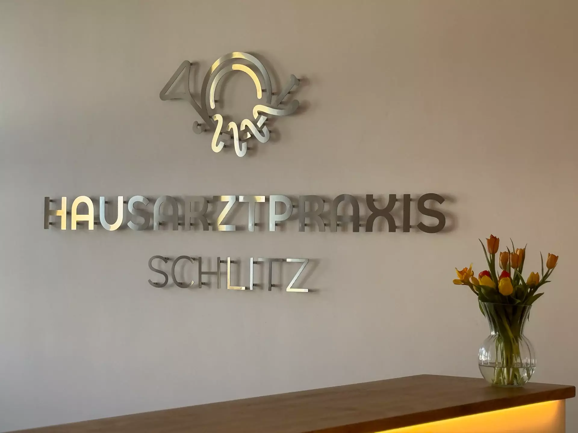
Config: stainless steel, brushed, 2 mm, individual elements, stand-off click system, 200.9 × 95.3 cm
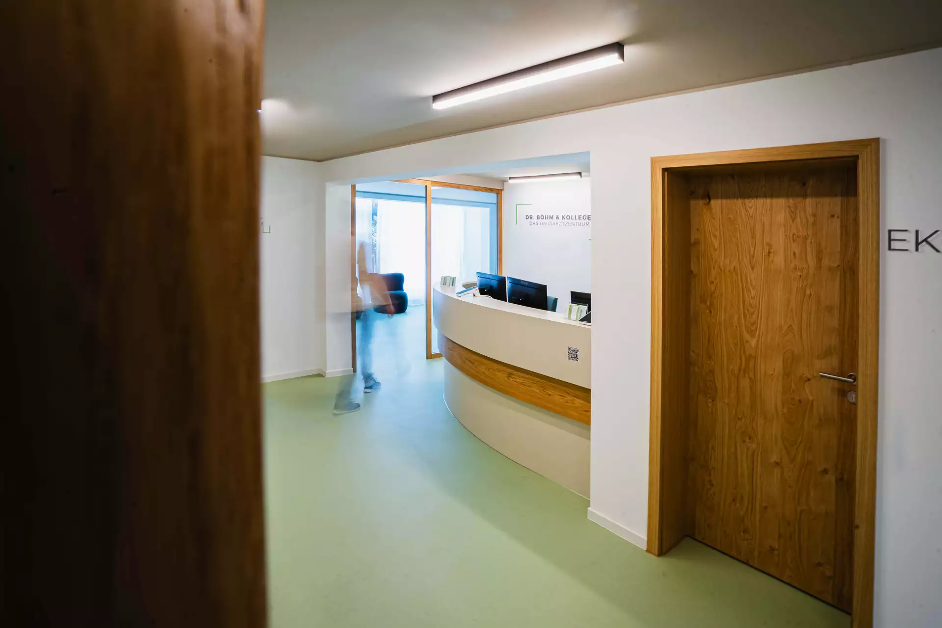
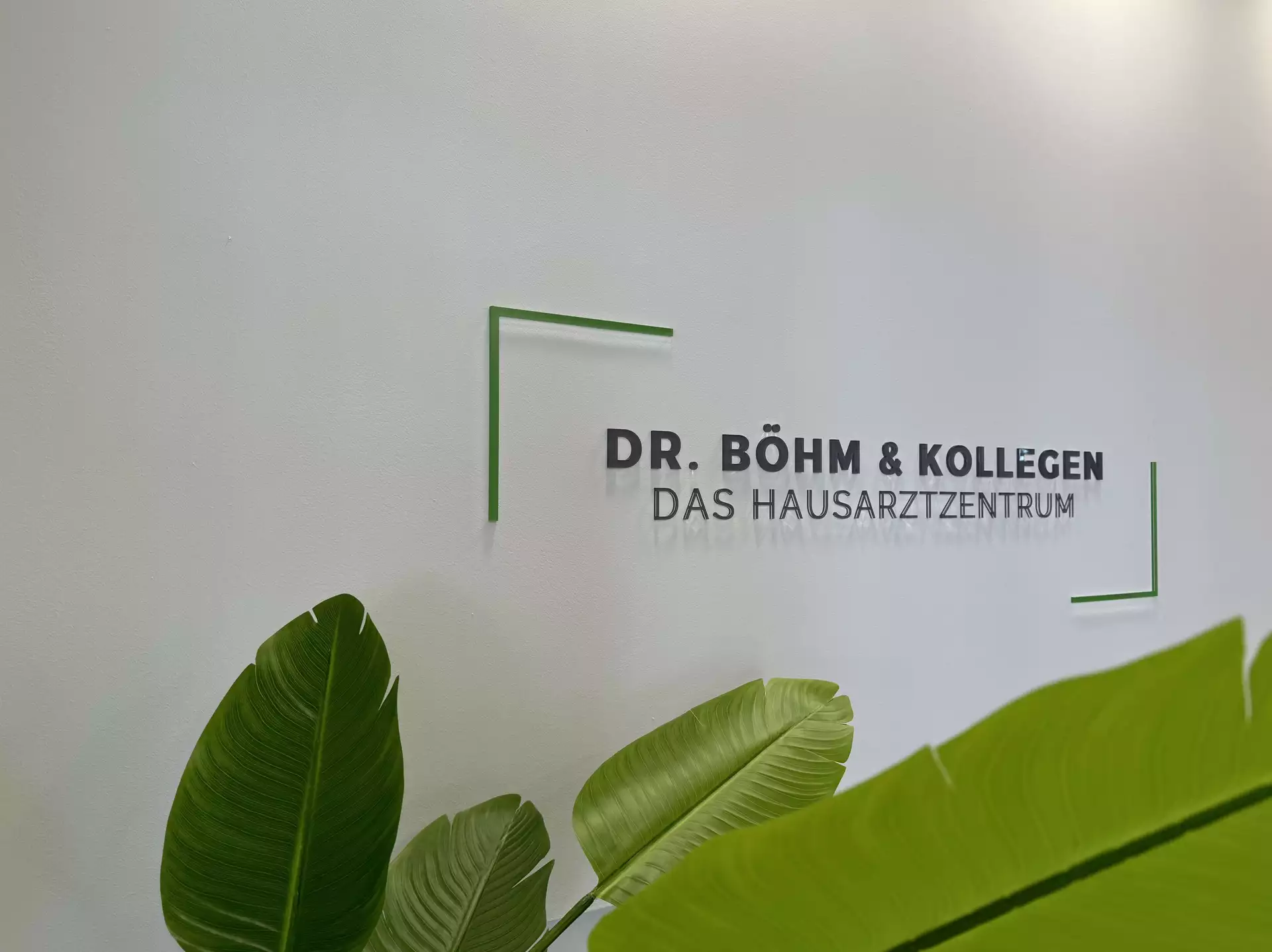
Dr. Böhm & Kollegen, Esslingen
A 6 mm acrylic with UV direct print in a glossy finish, mounted flush with full-surface adhesive, 1.5 meters wide behind reception.
Where the Schlitz logo trades on material, this one trades on color. UV direct print reproduces the practice's exact brand colors, greens and warm grays, in full CMYK, so the logo matches the interior’s natural and calm feel. The glossy surface makes the colors shine in the daylight.
Flush adhesive mounting keeps the piece quiet, with a discreet shadow, and the logo behaves like part of the architecture.
Hausarztpraxis Nord
A large UV-printed acrylic logo behind the reception desk, repeated along the hallways patients walk through.
The main piece hangs behind the reception desk where patients check in. The reception area is a large open area that has a ceiling that is painted as a clear blue sky - so the logo and reception desk are located right under it. The same logo returns along the hallways on the way to the treatment rooms.
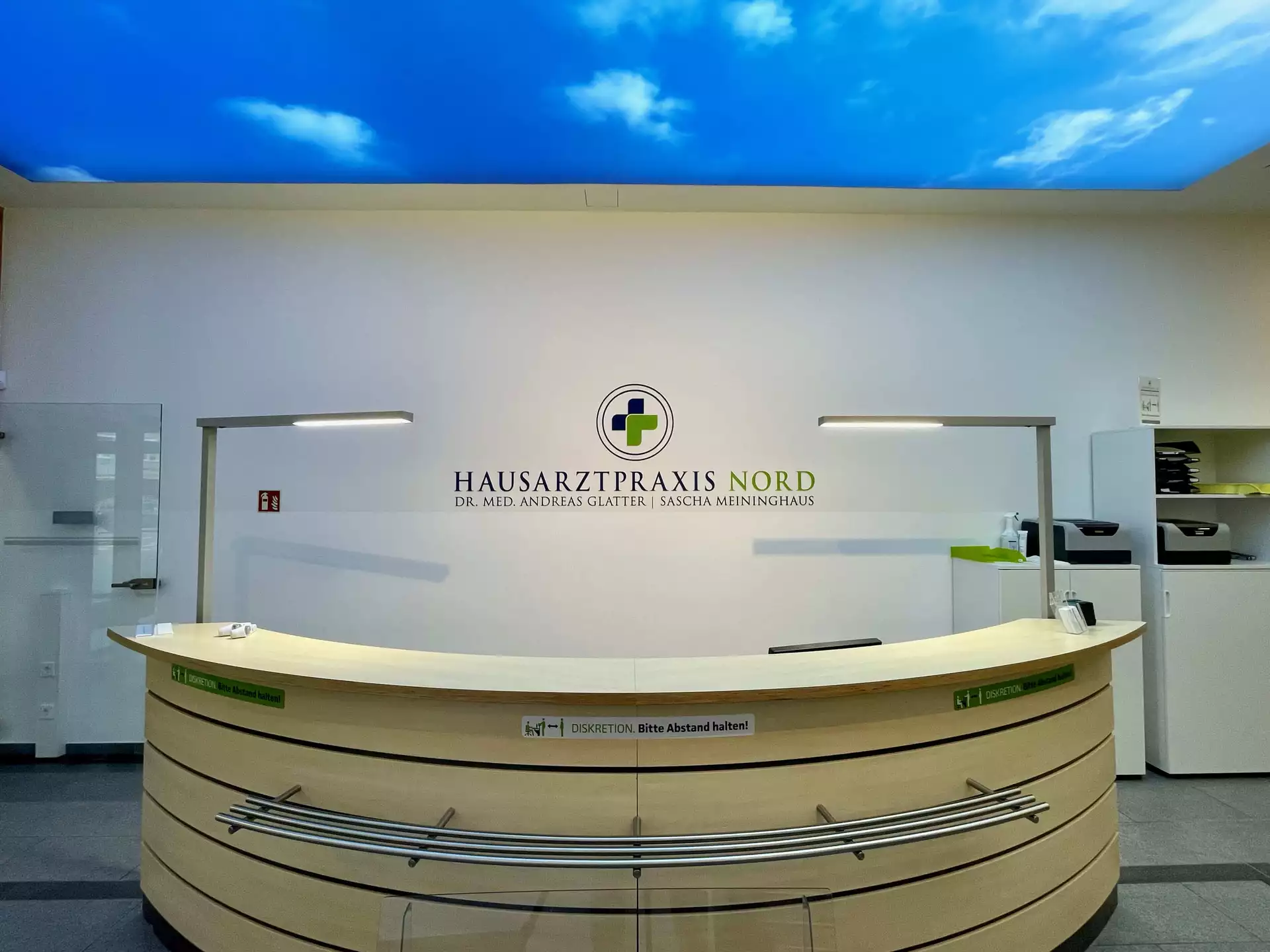
Config: acrylic, UV direct print, self-adhesive
Calming 3D Logos for Therapy Practices
Vetter Physiotherapie
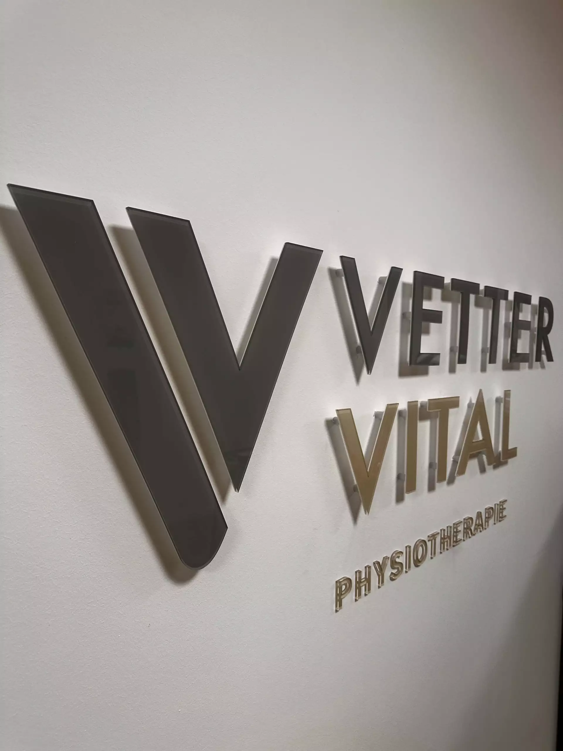
An 8 mm through-dyed acrylic logo in a glossy finish, mounted on stand-offs in the consultation room, 1.4 meters wide, in a muted green and cream.
Two placement decisions make this one work. First, it sits next to the consultation desk, in the patient's natural line of sight during every conversation about their treatment.The brand is present at the moment trust is built, not just at check-in.
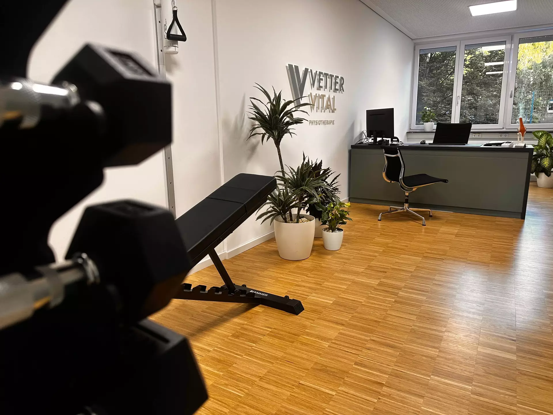
Second, its position relative to the window turns the stand-off mounting into a sundial effect: natural light throws a soft shadow behind each element, and the logo gains extra depth, an effect that is characteristic of 3D cutouts.
Through-dyed acrylic makes the color run through the full 8 mm of material, so the edges show the same green as the face.
Sascha Breuer, Integrative Haltung
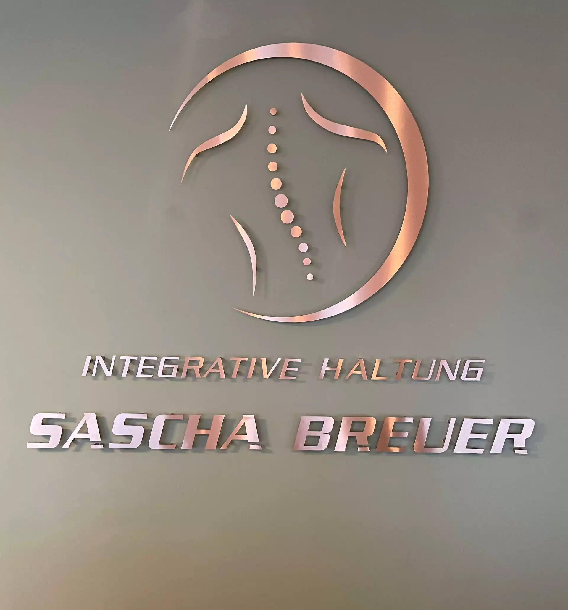
Polished stainless steel, individual elements mounted on spacers, 1.5 meters wide.
Some logos nail their physical version more than others, and this is one of them. The design is unusually sculptural, depicting a human spine, shoulders, and back silhouette, and when carved from metal, it achieves something no screen can: it makes the idea tangible. A matte wall, shiny metal, maximum contrast. For a practice where everything revolves around posture and the body, the design hits the mark without being flashy.
In the photos, the stainless steel appears almost copper-colored. This is due to the orange ceiling, whose color is reflected by the polished steel, as stainless steel reflects the light of its surroundings. In the configurator, you’ll see the logo in its actual metallic gray—the natural shade of stainless steel.
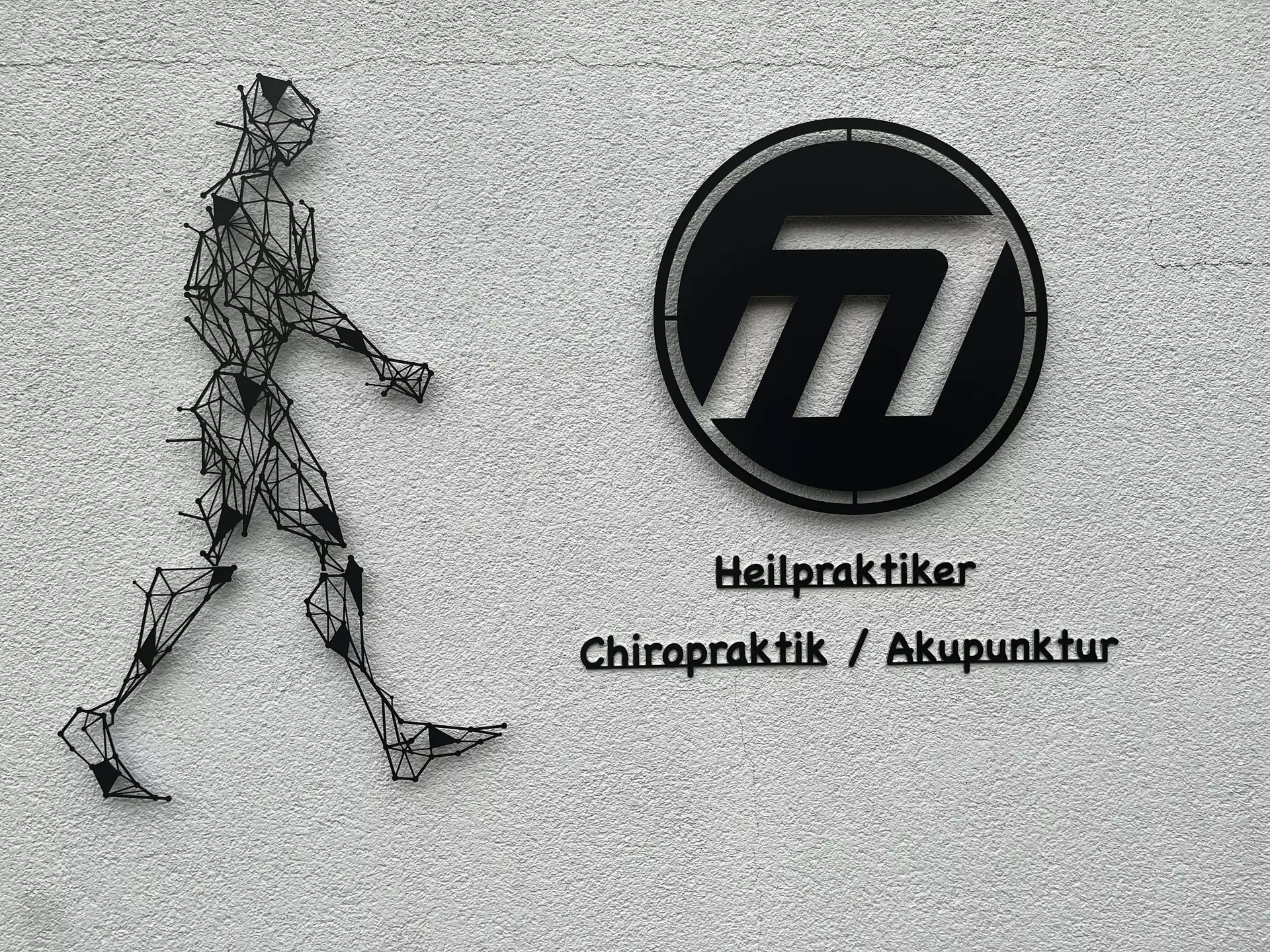
Mildenberger, Chiropraktik und Akupunktur
The facade piece of the collection: a human nervous system, cut from 2 mm aluminium, black anodized, mounted on stand-offs at the entrance, about 85 cm wide and over a meter tall.
Most practices put a name on the facade. This one put its subject matter there. A nervous system in black metal is unmistakable from across the street, tells you what happens inside before you've read a single word, and does it within the restraint expected of a medical practice: one color, one material, no light, no slogan. Black anodizing keeps the aluminium weatherproof and matte, so the piece reads as graphic even in full sun instead of glaring.
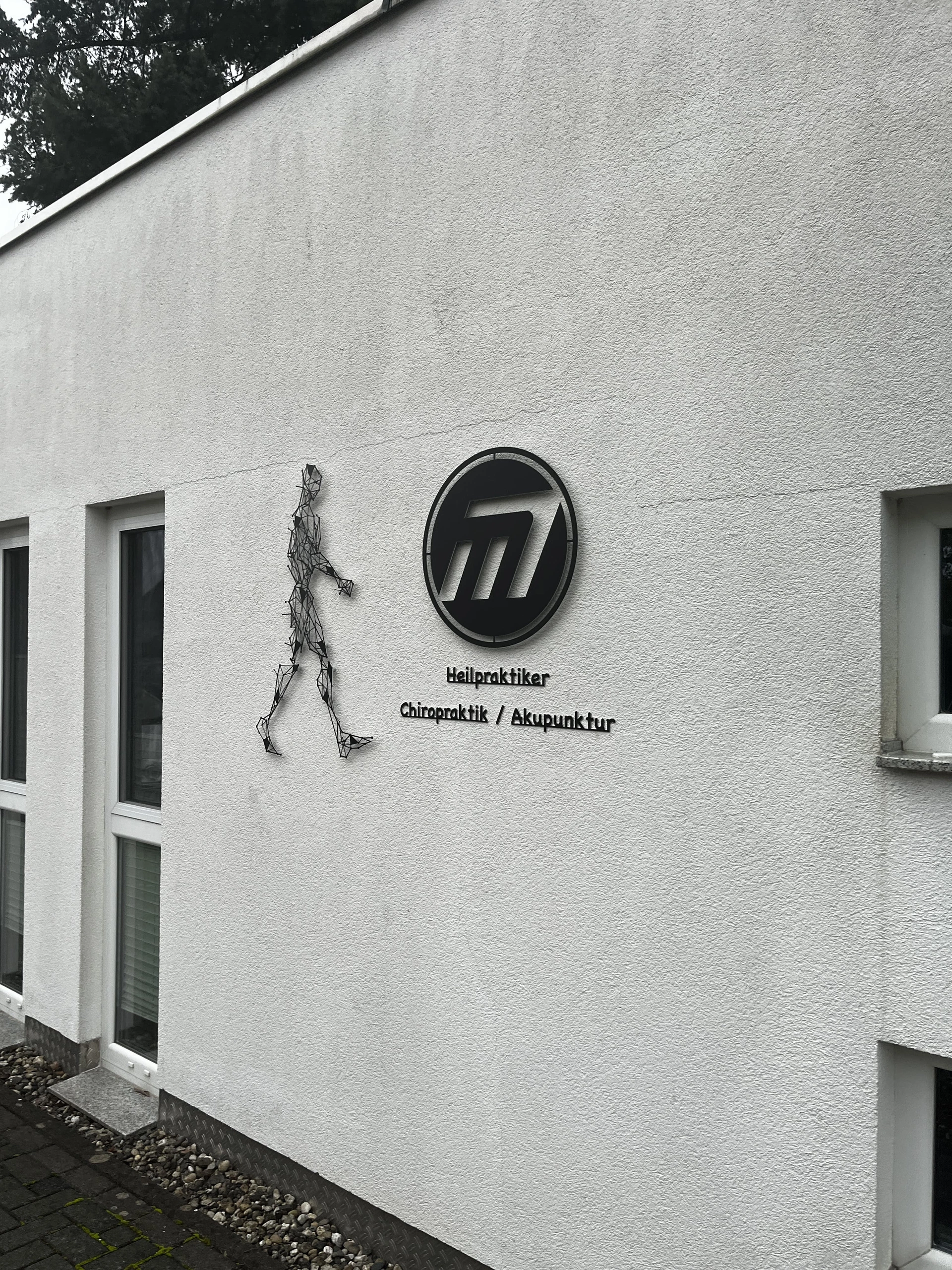
It's also the best argument in this collection for treating a logo as an object rather than an image. On a business card, this design is an illustration. On the building, at this scale, it's closer to a sculpture.
Large Logos for a Radiology Practice
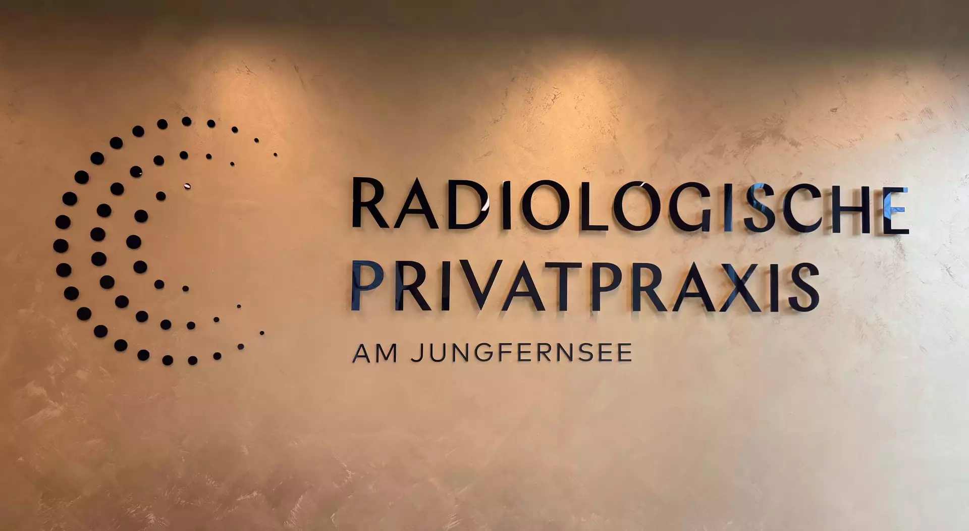
Radiologische Privatpraxis am Jungfernsee, Potsdam
The largest interior piece here: three meters of front-printed aluminium composite, 3 mm, in a single dark tone, mounted across a decoratively painted reception wall.
The reception welcomes patients with one long, quiet logo in one deep color. At three meters, the dark purple logo sits on a bronze painted wall, an exquisite pairing that catches and reflects the light. The size doesn't affect the logo's stability, since the letters and elements are mounted individually.
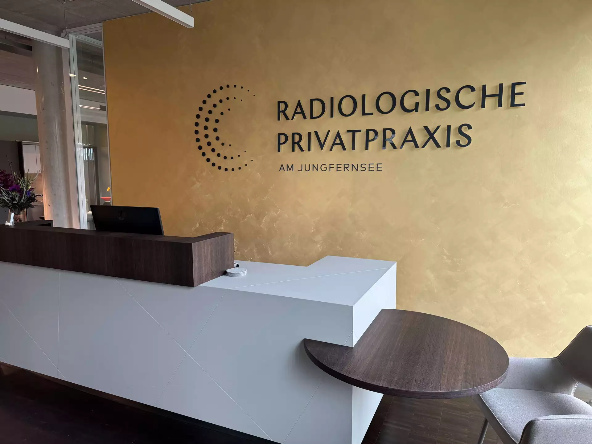
What's particularly nice about this piece is the hybrid mounting: the big letters sit on spacers, while the small ones and the different-sized dots that make up the design are mounted with self-adhesive pads. Each element gets the fixing method that suits its size, and whole appearance of the design works perfectly together.
Beyond the doctor’s office: branding where the work happens
IMS Rettungsdienst
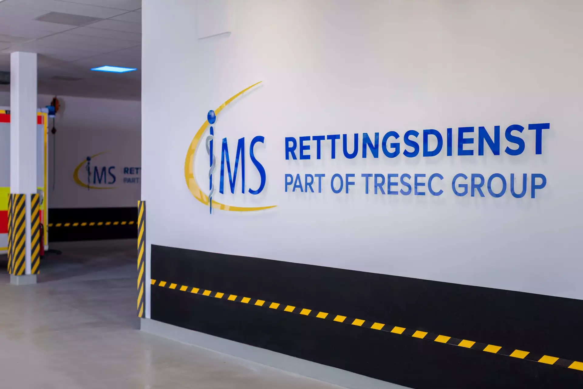
Not a Praxis in the classic sense, but the doors here open constantly: patients, medical representatives, partners. IMS is the emergency response unit of the TRESEC GROUP, and the piece we're showing hangs in the last place most organizations would think to brand: the vehicle hall where the ambulances park.
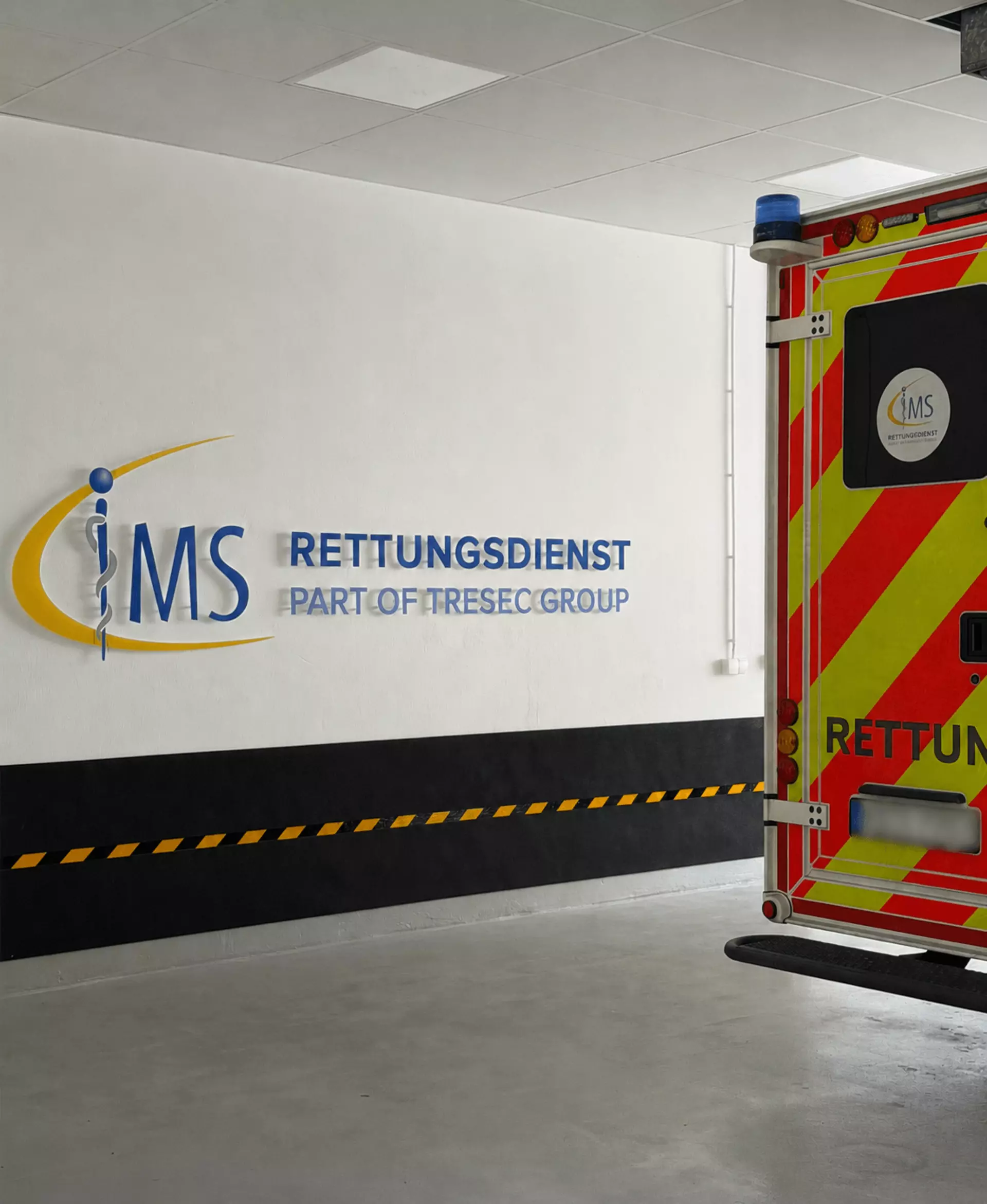
Back-printed acrylic, 3.3 meters wide, glossy finish, mounted with adhesive pads. Reverse printing means the UV print sits on the back of the 6 mm acrylic and is viewed through it, so the surface facing the room is the acrylic itself: the color gains depth from the material in front of it, and the print sits sealed behind it.
The real insight is the placement. A vehicle hall is pure function: concrete, equipment, vehicles. Branding it says the identity doesn't stop where the public area ends, and the people who see it most are the crews who work there every day. That's branding pointed inward, at the team, which for an emergency service might matter more than anything in a waiting room.
TRESEC didn't stop at this one piece; they branded the entire building with us.
Standing out as a doctor’s office or medical organization
Healthcare is a competitive niche, and being good at your job often isn't enough anymore. Patients share more characteristics with consumers every year: we're used to being marketed to, and we register branding messages whether we're aware of it or not. A practice that looks generic reads as interchangeable.
At the same time, doctors and therapists can't answer the competition the way other businesses do. The rules that keep medical advertising objective and factual leave little room for campaigns or comparisons, so the usual playbook is off the table.
That's the role a 3D logo plays in a medical practice. It works entirely within those limits, because it doesn't advertise a treatment, it marks a place and shows that this practice pays attention. The nine examples above prove how differently that can look, from brushed steel in a former post office to a nervous system on a facade. If you want to see what your own logo does as an object, upload it to the Web2Cut configurator and see it in a realistic preview, with price and delivery times, before you decide anything.