Acrylic glass logo with shadows on office wall

Typography
& Signage

Signage elements play an essential role by not only being aesthetically pleasing, but also providing orientation and reinforcing brand identity. They create an emotional connection and make it easier to navigate a space by harmoniously combining both decorative and functional elements.

Form follows function

In typography, the principle “form follows function” means that the design of letters and texts should be designed in such a way that they are easy to read – no matter from what angle or in what light. It ensures that the look of the font supports its primary purpose of conveying information, while also looking good. By taking the following design tips into account, you can ensure that your texts are not only beautiful to look at, but also easy to understand in any situation.

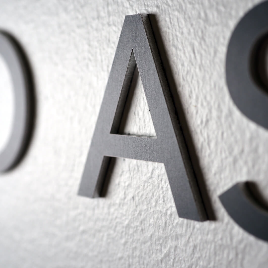
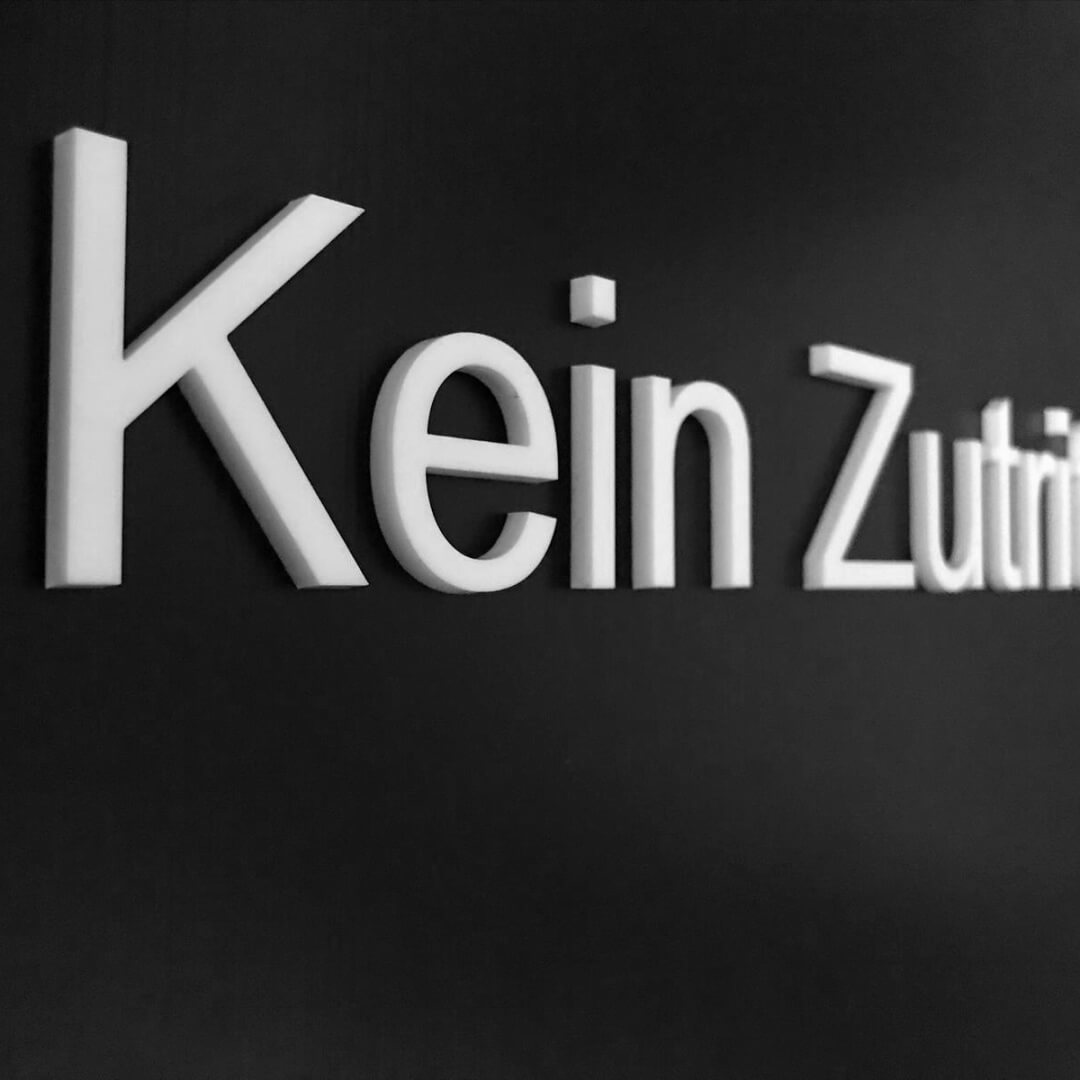
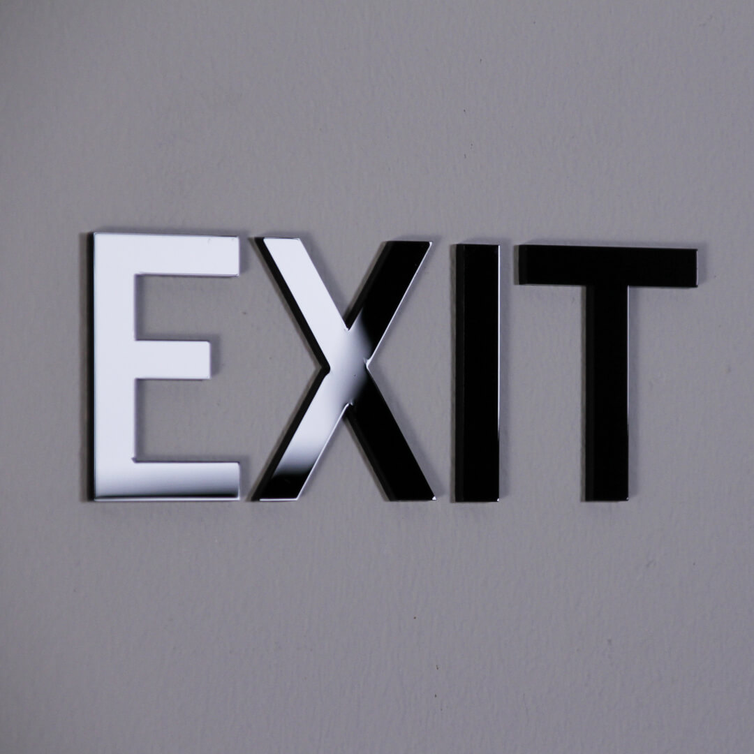
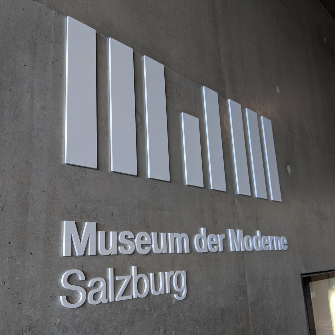
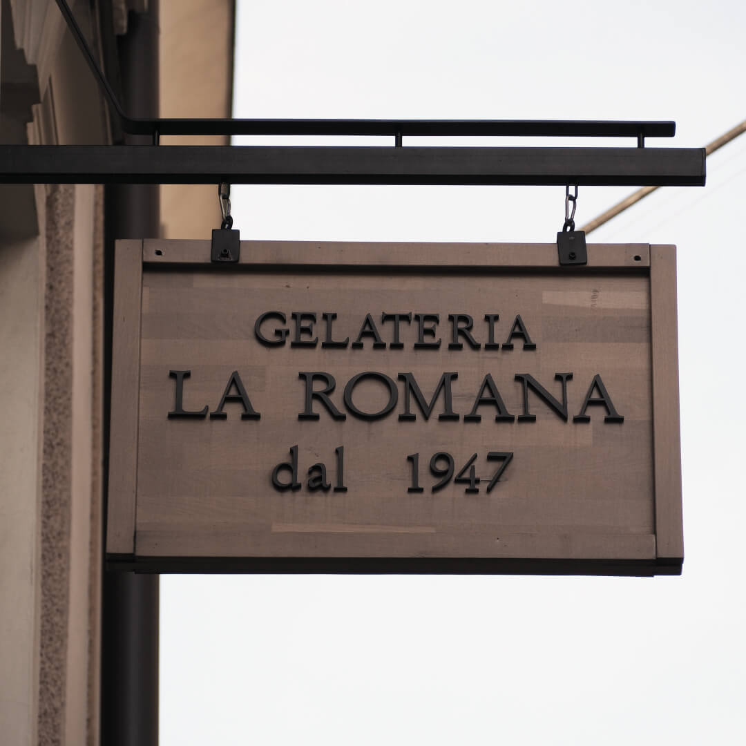
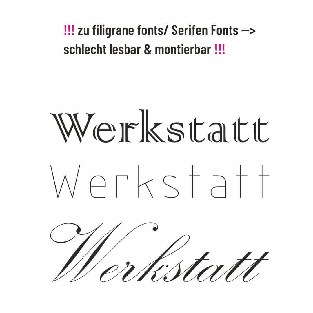
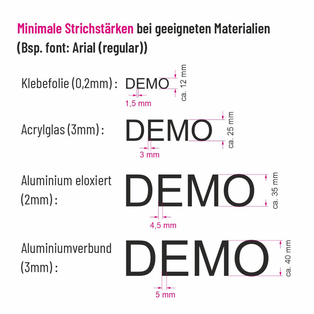
Font, line width & font size:

In general, you can upload graphics with any font as a motif. So you can stay true to your corporate design in the typography.

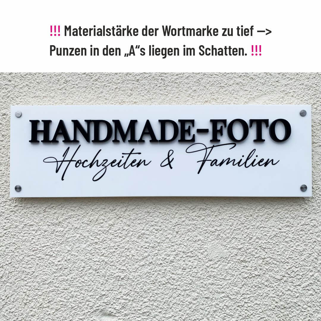
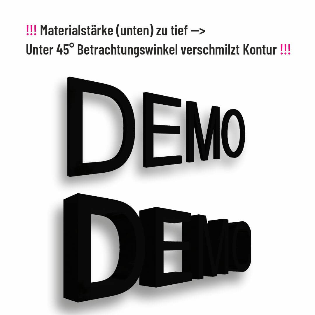
However, for good readability and mountability, simple and clear fonts are preferable. This means that fonts with pronounced serifs or delicate line widths should be avoided at all costs.

Due to assembly requirements, the minimum line widths are limited, even for materials that are generally suitable. The approximate minimum font sizes that can be achieved result from this. (see graphic attached)

Material & Depth

A common misconception is that you should always aim for the greatest possible depth or material thickness. However, too great a material depth has two main disadvantages:

  • From a sharper viewing angle (not from the front but from the side), material that is too deep merges into an illegible block because the background in the gaps is no longer visible.

  • Especially in hard light from acute angles of incidence, hard and long shadows can make readability worse.

A very good rule of thumb is that the material thickness should not significantly exceed the line width of the text. The following materials are very suitable for typography: adhesive film (0.2mm), acrylic glass (3-6mm), anodized aluminum (2mm), aluminum composite (3mm)

Color & Finish:

Black is usually ideal for labels because it provides a strong contrast (exception: dark walls, then white). It remains clearly visible under different lighting conditions, has a neutral color and goes well with many corporate colors. It also conveys timeless elegance and professionalism.

When choosing the finish or surface, we usually recommend a matt look for signage elements. Matte materials have the advantage that the surroundings do not reflect and therefore have a consistently high contrast and good readability. With glossy adhesive films, the additional problem is that they take on the structure of the surface (e.g. rough plaster) and then reflect many small highlights that impair readability. 

Icons and symbols:

Just like with website design, it can also be more space-saving and elegant when it comes to company interior design to replace bulky words with appropriate icons.
For example, the “Print & Copy Room” can be clearly labeled with a stylized printer symbol.

A coordinated iconography that matches the corporate design loosens up the communication of functional and location descriptions without losing clarity.
You can find a large number of inexpensive, coordinated icon and symbol collections on the Internet. These can easily be converted into cuts in our configurator.

Configure Now! with instant pricing Configure Now! with instant pricing