Macro shot of a sprayed design on a cardboard

Surfaces & Edge Sharpness

Stenciling is very easy. However, to ensure it works as well as possible and you achieve exactly the result you want, there are a few small things to keep in mind. Below, we have summarized some hints and tips for you.

Cool stencil look or razor-sharp edges
- Here's how it's done!

How sharp and precise you can apply your design to the desired surface mainly depends on two factors: the material thickness of the stencil and how closely it lies on the surface during paint application. By choosing the right stencil and paint application method, you achieve the ideal result for your specific requirements.

Material Thickness

Thicker is better, right? Au contraire, mon frère!
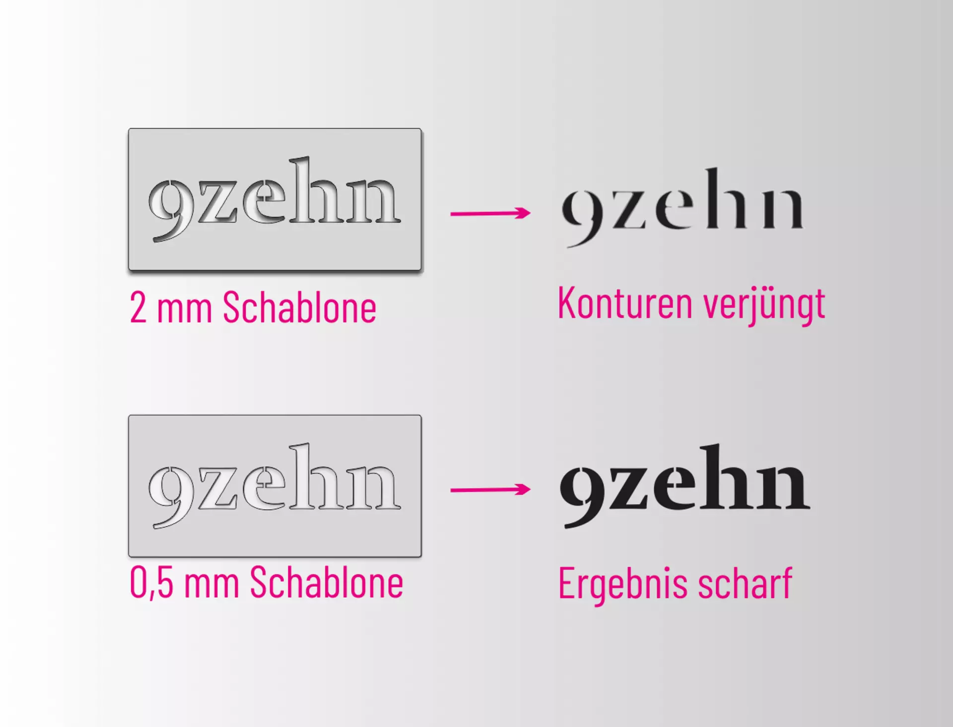
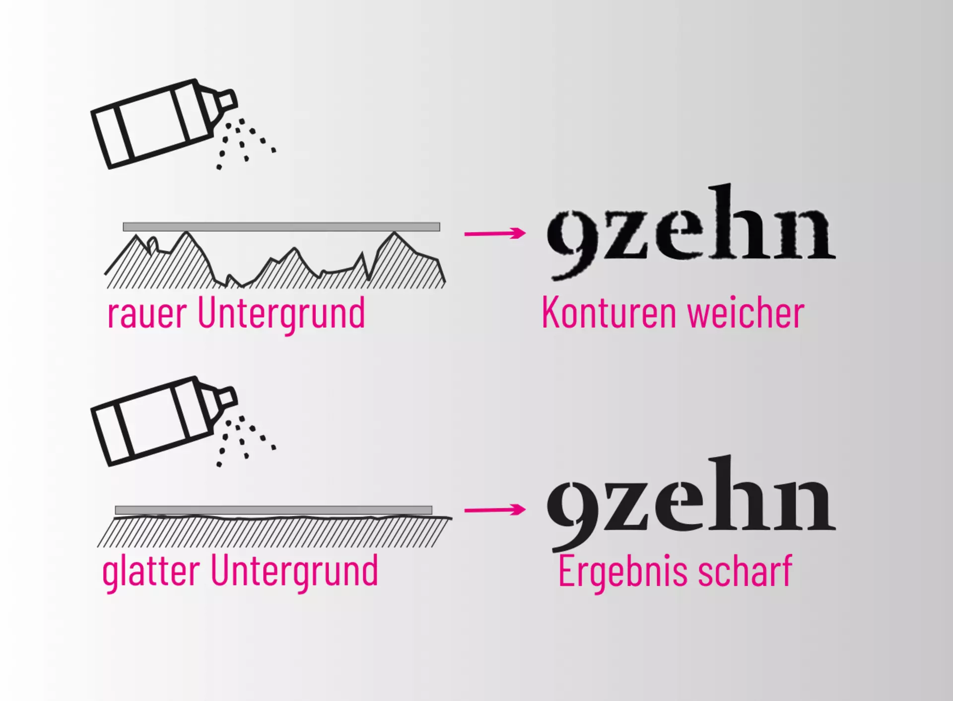
With thinner stencils, you get sharper design edges because the paint cannot penetrate into the corners as well with thicker material. So, we're not trying to save costs but to enable the best result. Our choice for metal stencils, therefore, is stainless steel sheet, not aluminum. Here, we achieve the same weight & stability at about a third of the material thickness. An exception is made for burning stencils, which need to be a bit thicker so they don't deform under high heat.

Technical Production Advantage
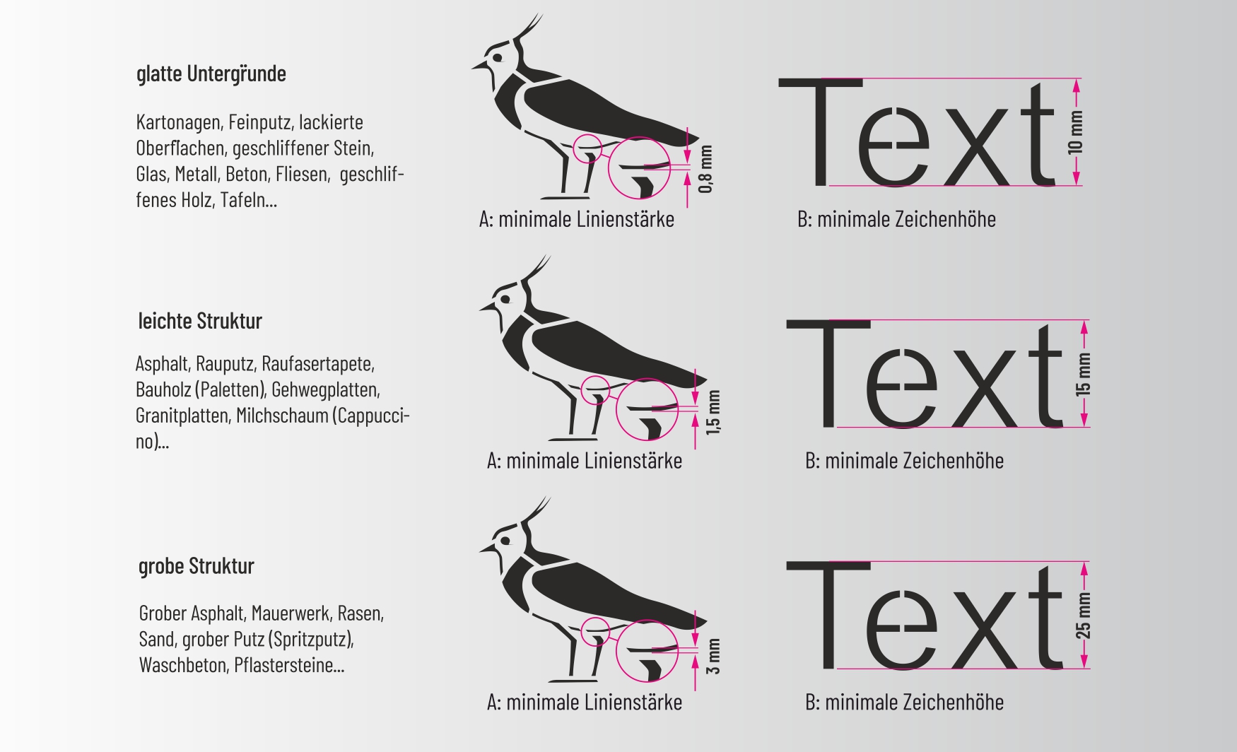
Our thinner material thicknesses, whether plastic (0.35mm) or metal (0.5-1mm), allow for a much higher resolution during laser cutting. Thus, we can cut much more delicate texts & motifs. Of course, the stencils are still stable.

§D-Zahl 2021 mit Schablonenstatistiken

Surfaces

The smoother the surface, the sharper the result.
Reusable metal & plastic stencils always rest on the highest points of the surface. At these points, the contours are sharp. Where the stencil has a bit more distance, the contours blur, creating the typical "stencil-look". An exception to this are the self-adhesive painter's stencils, which conform closely to the texture even on rough plaster or textured wallpaper. With proper use, razor-sharp results are guaranteed here.

Depending on the application/surface and stencil, you need to consider how delicate your motif should be. If you want to sign smooth cardboard, you can represent very fine texts & designs, but for a chalk spray application on rough asphalt, everything should be a bit larger. For this, refer to the "Datasheet" PDF for the respective stencil.

Detail Sizes & Surfaces

Minimum line thickness & character height. These measurements are not strict guidelines but rather rough design directions or empirical values. If you follow them, your motif or text should, according to our experience, work well or be readable on the respective surface. With texts, the font type is, of course, also relevant. Simple, plain fonts are more readable than handwriting or fonts with fine serifs.